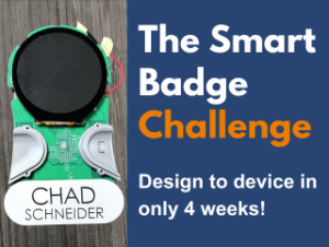
From Clunky to Captivating: The UI Journey
(Catch up with Part One and Part Two first!)
(Or continue with Part Four!)
Welcome back, makers and innovators! This is Part 3 of our Badge Challenge blog series, detailing the development of our Root3 Labs “Smart Badge”.
We’ve already explored the early design process and fabrication journey, but today, we’re diving into the digital world of the user interface (UI). It was quite a journey from clunky demo software to the clean Badge interface we have today, so keep reading to see how we got there!
The display we would be using came with its own demo software, which is where we started developing the Badge’s software. However, it became clear early on that the demo software was clunky at best. Designed for a larger screen, it felt cramped and awkward on our small circular display. While we would have been able to get a functional interface out of it, it would have been like trying to navigate the web on a clunky touch screen the size of a stamp. We knew we could do better!
We tried the manufacturer’s drag and drop UI builder to speed things along, but it proved inflexible and costly, quickly becoming a dead end. Deciphering the original code’s quirks took a full week, with it’s complex nested code structure adding another dead end as it slowed our coding efforts down.
But we would push on, determined to transform those clunky UI bones into something functional and clean. It definitely wasn’t going to be easy, but we do love a challenge here at Root3 Labs.

“It felt daunting at certain moments, sure,” Brian Bock, UI designer on this project, admitted. “Initially, we weren’t really thinking about all the future challenges. It seemed straightforward at first, but once we got deeper into the software and coding, the deadline felt a little tighter. Thankfully, I could really lean on Christina and Chris for their input, and especially Chris’ expertise. We did a lot of collaborating on this project, and I don’t think we could have turned it around so quickly otherwise.”

Crafting a User-Friendly User Interface:
We had to consider the unique circular layout of the badge and the limitations of interacting with just one finger. Early edits to the clunky demo software, while functional, felt far from our vision. Luckily Chris, our electrical lead, is somewhat of a software wizard and was able to tag in for some brainstorm assistance.
First, we tried dividing the screen into four quadrants for different functions, then shifted to a tabbed model, and even considered different swiping gestures. Ultimately, we landed on an “invisible button” in the center, triggering a “slideshow” of pages like contact info, QR codes, and the logo.
Initially, we were hung up on trying to replicate traditional website UI, but thinking outside the box is what led to the best solution for the problem. The original UI, while functional, wasn’t optimized for the small screen and single-finger interaction. It was a powerful reminder that the medium shapes the interface. This mind set change meant we weren’t stuck trying to force-fit a web browser experience onto a completely different canvas. A keyboard and mouse interface would never work on a small touch screen, and a single finger wouldn’t work well on a web browser shrunk to a tiny circle.
The final interface might seem simple with a single tap used to navigate. But that simple tap on the screen cycles through each page, offering a smooth and intuitive experience for users. This journey wasn’t just about functionality, but about embracing limitations and turning them into innovative solutions. We learned that the best interfaces are born from understanding the unique characteristics of both the device and the user.
It's Not a Bug, It's a Feature!
Our quest for a user-friendly user interface wasn’t without its hurdles. But hey, we’re Root3 Labs! We tackled each challenge head-on, finding workarounds and solutions that solidified our badge’s brilliance.
We came across plenty of eccentricities during development, like a software quirk that manifested as a “ghost click” in the upper left corner of the screen. It would have been an unwelcome phantom tap if there was anything clickable there. But our resourceful engineers see opportunity everywhere! We turned this “bug” into a feature, transforming it into an automatic screen-changing cycle. Talk about turning lemons into lemonade (or in this case, pixels into magic)!
We had plenty of other small knots to untangle before this journey was done. Trying to get the screens sized correctly for the circular layout was tricky at best. Adding new images and replacing existing ones involved some complex file format wizardry, a process where Chris, again, proved invaluable. We even had to become QR code whisperers, ensuring the resolution on the screen was high enough for those dense information squares.

There was one limitation that had the possibility of really derailing us. The display worked by building a static image, loaded once onto the screen. Dynamic data, like live EKG readings, seemed like a distant dream. The demo software offered pre-built graphs and temperature readings, but they were static snapshots, not the real-time magic we envisioned. This hurdle would become a stepping stone for the next phase, pushing us to explore innovative solutions for bringing dynamic data to life on our Badge.

The Future is Bright (and Dynamic):
The invisible button and our “ghost click” feature are testaments to our ability to turn limitations into innovative solutions. But let’s be honest, a single tap might not cut it forever. As we look at adding features like EKG readings and other dynamic data, the current display’s preference for static images presents a problem.
Even our current, user-friendly interface has its limits. Imagine trying to squeeze an EKG reading or complex customization options onto a screen navigated by a single tap. It wouldn’t be pretty, and the tap-to-change-page functionality might become incompatible with new features.
These challenges are more than just hurdles; they’re stepping stones to the next phase of development. We’re actively exploring solutions for displaying dynamic data, like EKG readings, that go beyond static images. Remote software updates are also on our radar, ensuring all badges stay up-to-date without physical tinkering. Each challenge is an opportunity to push boundaries and create an even more versatile and user-friendly Smart Badge experience.
Join Us on the Next Step:
We’ve come a long way from clunky demo software to the Smart Badge’s current intuitive User Interface. But this is just the beginning! Join us in Part Four, where we’ll be wrapping up this blog series! We’ll be looking into what’s next for the Smart Badge, exploring potential applications and the innovative functionalities we want to work on in the future.
Wondering How to Get Your Product
Development Process Right?